Dropdown menus, when used well, are a very useful form of interaction. While the pros and cons of dropdowns have been well discussed elsewhere, it’s useful examining them in the context of language/region selection.
When a user interacts with a dropdown menu, it’s a reasonable expectation that there are a certain degree of choices contained within the menu — hence the designer’s choice in hiding the content.

Left to right: The Guardian, Moo and CNN
But looking at the region selection dropdowns at The Guardian and Moo, the dropdown only reveals one extra choice: wouldn’t this be far simpler (and more obvious) as either a radio button or list of links? CNN has more regional choices than The Guardian or Moo, yet they have opted just to list the options available.
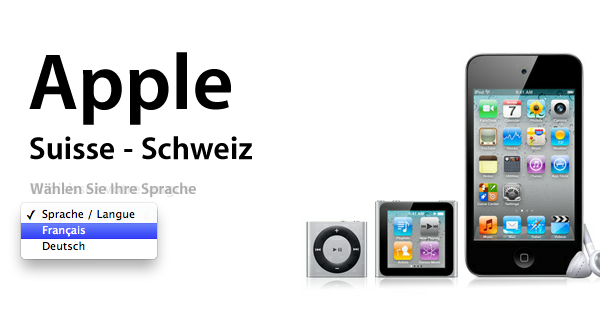
Apple’s website also features a two-items dropdown for
languages for both their Swiss and Belgian sites
CNN’s approach is simple and effective: don’t complicate selections of anything on your site with a dropdown unless there are numerous options that would otherwise clutter the page.
(Note: while CNN is very well designed, linking to the Arabic edition of its content would be better done with Arabic written in its localised form rather than just the English).

