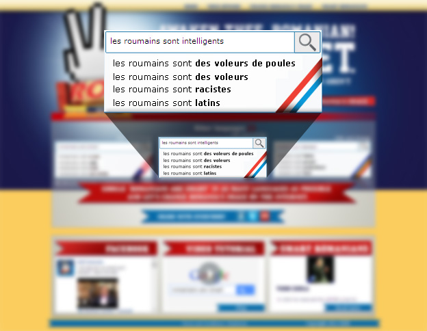
The website Romanians are smart has an interesting and noble objective: change the results associated with “Romanians are…” on Google into something more positive.
If you go to Google and type “Romanians are” in and wait for the autocorrect to kick in and you’ll see for yourself how racist the current results are.
The site encourages users of different languages to click on a link that enters the term “Romanians are smart” into Google (in their language), hopefully moving the more positive search term further up Google’s list of autocorrect options.
On the homepage there are links in English, French and Romanian. These languages are also complimented by flags. Romanian has a Romanian flag and English gets the United States treatment. But as for French, it appears the site has the wrong flag.
Light blue on top, white in the middle and red on the bottom — the flag used for French is far more similar to Luxembourg’s flag than that of France’s.

France
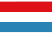
Luxembourg
French is spoken in both France and Luxembourg
However, the flag used could also be seen as the Dutch flag — could this flag choice confuse a Dutch user thinking they were accessing content in Dutch?
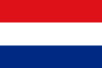
Netherlands

Luxembourg
The Netherlands and Luxembourg share an almost
identical flag but share no common language
Obviously this is probably just a simple design oversight — the French flag is simply upside down. But it still demonstrates the problem with using flags to represent languages.
Coincidently, the nature of this site highlights another case of near-identical flags: that of Romania and Chad.


Can you tell which is the Romanian flag and which is the Chadian?
Romania also shares a very similar flag with its neighbour Moldova — the main difference being the presence of the ensign in the centre and different proportions.

Romania

Moldova
Romanian and Moldavian languages are mutually intelligible and extremely similar
But compare Moldova to Andorra’s flag and again they are very similar:

Moldova

Andorra
Catalan is the official language of Andorra
There are many more examples of national flags being almost identical or very similar: Indonesia and Monaco; Slovakia and Slovenia. There are some interesting articles on Wikipedia and Wikia that cover the topic in more depth.
The fact that flags can be identical or very similar again shows that relying on flags to represent languages can be very problematic. In fact the same issue also goes for country selection in general. At large sizes these flags can be confusing: but what about at an icon level?
The famfamfam icon set is a free set of flag icons that are very popular around the web. They work especially well at small size. But as the examples below show, many flags look even more similar when reduced in size, increasing the chances of possible confusion. Furthermore, many of these countries share geographic areas:
 Romania
 Chad
Chad Moldova
 Andorra
 Netherlands
 Luxembourg
 Paraguay
 Croatia
 Mali
Mali
 Guinea
 Cameroon
 El Salvador
 Honduras
 Nicaragua
 Argentina
 Jordan
 Kuwait
 Sudan
Sudan
 United Arab Emirates
 England
 Georgia
 Faroe Islands
 United States of America
 Malaysia
 Liberia
 Puerto Rico
 Indonesia
 Monaco
 Poland
 Singapore
 Australia
 New Zealand
 Falkland Islands
Adding country name labels is a simple and effective way to prevent confusion with flags — as is organising alphabetically or by geographic region.
But for languages, geographic regions don’t necessarily apply — and nor do flags, as both transcend geographic and national boundaries.
“However, the flag used could also be seen as the Dutch flag — could this flag choice confuse a Dutch user thinking they were accessing content in Dutch?”
To answer your question; probably not. But I do catch myself mistaking a Luxembourgish for a Dutch one.
However I did not realise that flags are such a big problem. I guess because I mostly see the Dutch and English flags. I’ll start using text!
To answer the question “However, the flag used could also be seen as the Dutch flag — could this flag choice confuse a Dutch user thinking they were accessing content in Dutch?”
I would say, “No” if the users had known about the flag of Luxembourg. In this case, I believe many Dutch know about Luexembourg’s flag. Although both flags are similar, they have different blue colour. However, mistake can happen when someone is not aware of it.
Actually, websites do not always use the correct colour for flags, often they add effects and stuff (like shine for whatever reason and shadow) that change the colour of the flag. I’ve seen Dutch flags on Dutch websites that look like Luxembourgian flags, as such, it can be quite hard to actually know which one is which. Also, the red on that site isn’t quite the right colour.
The colors are different because they are representing the Bohemian and Moravian heritages through the rulers coat of arms..the blue is light blue…nothing to do with the Netherlands and Belgium would be related to Germany? The three are Benelux countries BE Belgium NE Netherlands and Lux etc…
The Romanian flag is the one with the lighter blue strip, compared to that of Chad.
To be fair, Puerto Rico 🇵🇷 is part of the United States. It’s a US Territory… which SHOULD be granted statehood as well as full representation in US Congress (it only has partial representation now… for reasons far too complex to get into that but mostly stem from old racist politics). So, they’re more than welcome to adopt any part of the US flag as their own, since it IS their heritage too.
They’re also one of our only US territories with any Congressional representation and voting rights at all… which is weird when one considers the US is a nation that went to war and won its freedom over the very principle that “taxation without representation” was inhumane as it stifled freedom… (just one white girl’s opinion). 😉