From the inside of a pair of Monster headphones, a particularly brilliant example of inappropriate flags-as-language selection:
Nicely played Monster: you’ve managed to offend both Canadians and French with one terrible design decision.
From the inside of a pair of Monster headphones, a particularly brilliant example of inappropriate flags-as-language selection:
Nicely played Monster: you’ve managed to offend both Canadians and French with one terrible design decision.
The Duolingo homepage shows six flags on its homepage to demonstrate what language services it offers. While the United States flag is used for English, perhaps more unusual is the Brazilian flag being used for Portuguese. Yes, there are more Portuguese speakers in Brazil than Portugal, but for anyone with a knowledge of flags this would appear quite strange.
However, considering Duolingo teaches US English and Brazilian Portuguese, this perhaps isn’t so strange. But yet again we hit a problem when looking at Spanish: Duolingo teaches Latin American Spanish, not traditional (Castilian) Spanish as spoken in Spain. The flag metaphor definitely breaks here.
Going back to the juxtaposition of flags and languages on the homepage: does this actually detract from Duolingo’s main message? The language names are in light grey text which is not overly visible in the first place. Look at the page again with the language names removed:
The message now suggests quite strongly that Duolingo is only available in Spain, USA, France, Germany, Brazil and Italy.
If the flags were removed, could Duolingo’s services actually be clearer and better sold to a user?
Learning is an active and verbal exercise: the text and labelling here should reflect that. And that’s another area flags fail in: they don’t reflect that active or verbal element.
This might not be as colourful without the flags, but considering Duolingo’s lovely artwork and owl character, I’m sure both could be reconciled to create a far stronger and clearer homepage without flags representing languages.
Smartisan is a new Android-based mobile operating system designed in China. The launch was in Chinese, however Engadget gave an in-depth summary of the launch in English.
One feature relates directly to language selection. From the Endgadget overview:
Country flags instead of text menu for language setting, so that you can easily reverse the damage if someone accidentally changes the language
In the launch, founder Luo Yonghao shows a scenario where the phone has had its language changed — and shows how the new operating system will help redress a situation like this. It’s in Chinese, but the video is easy enough to follow: and a caveat here, I don’t speak Chinese, so this blog post is based purely on the visuals shown by Luo Yonghao. The video starts by showing the difficulties users would have on various phone operating systems (Android, Windows Mobile and iOS) if they have to change the phone language back but can’t understand any labels:
It ends with rapturous applause as Luo Yonghao show’s Smartisan’s solution to this problem: a bar with flags to denote language settings.
Having a phone with a different language can indeed be extremely frustrating: I myself recently borrowed a Palm Pre from a German friend and had a lot of fun trying to find how to change the language to English. It’s a definite problem: although in practice I think in most scenarios where a phone’s language is changed into an unintelligible language it’s usually the result of a prank rather than a user mistake. (And it’s quite a good prank for precisely this reason: it’s a real pain to undo.)
While the flag icons definitely help, I don’t think they’re ideal here because they could also suggest regional or location settings: timezone, date format or currency. I think some of the approaches highlighted elsewhere on this site would work far better.
But stepping away from icons, Smartisan could actually do far better to deal with this sort of scenario — and in fact, all software designers could.
Let’s reconsider the scenario we’re dealing with here: a user who speaks language X is trying to change the language of the phone which is in language Z.
Going back to the Smartisan example, the flag icons are at the very bottom of the settings screen. A user has to scroll to the very bottom to find them.
Consider the following ideas for dealing with this problem:
For example, the current Android OS after changing the language from English to Chinese. On the left is the main system menu, and on the right the language sub menu:
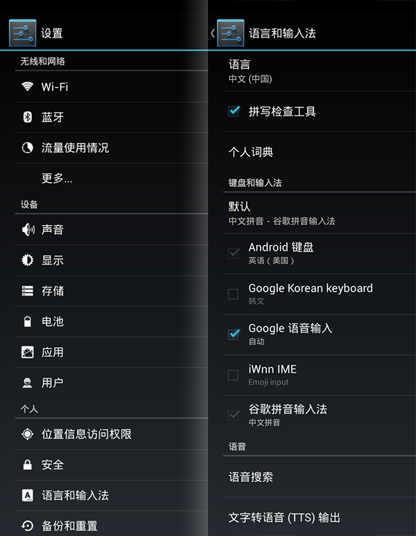
You’re in for some serious guess work here if you don’t read Chinese and want to change the language.
Now using some of the above suggestions, a responsive way of dealing with accidental language changing — the labels are in English here but should be whatever the previous language was:
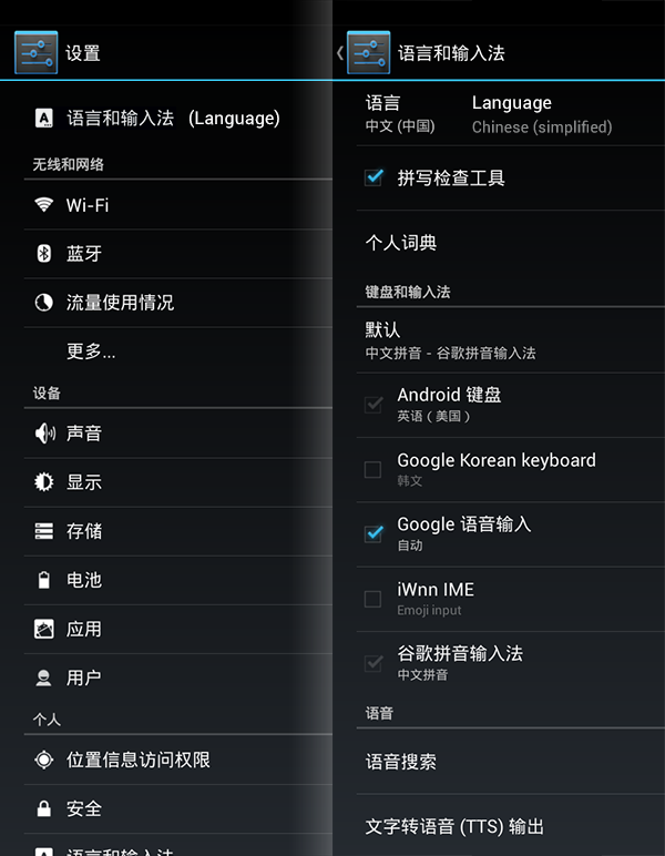
Would this be annoying for users who change their language on their devices? Probably not too annoying — and how many users do this anyway? Would it be useful for those who accidentally changed their language — or have been the victim of a prank? Immensely.
Flags aside, this is a much better way of dealing with language selection on all devices.
Officially known as Barclays Cycle Hire, Transport for London’s blue hire bikes are a ubiquitous sight around London. Hiring a bike is fairly straightforward using the interactive kiosks located next to docking stations around the city.
The kiosks support seventeen languages: along with English, the system is localised in German, Spanish, French, Italian, Arabic, Bengali, Gujarati, Hindi, Chinese, Polish, Punjabi, Tamil, Turkish, Urdu, Vietnamese and Japanese.
The icon for language selection is a British flag:
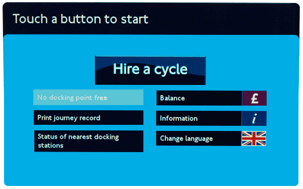
However, this is the only flag used for language, as shown on the language selection screen below:
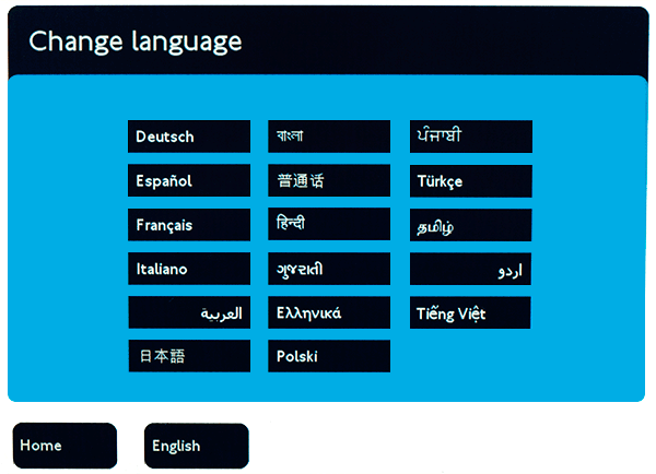
The use of the British flag is an interesting choice. While the system doesn’t explicitly use flags to represent languages, it does use a flag to show availability of languages.
It would be very interesting to see stats on how many users actually find and use localised versions of the kiosk. By using the British flag alone, could the system possibly miscommunicate itself?
London’s official promotional organisation London & Partners provides visitor statistics to London by nationality. The top three nations are the USA, France and Italy. This allows us to begin to understand the types of users who would be using the system.
Looking at the top three types of visitors, could users mistake the British flag for a currency icon rather than a language icon? Payment is only available in the Great British Pound — visitors from the US may want to use US dollars or visitors from the EU may want to use the euro. (This may be either cancelled out or confused even further by the pound icon next to ‘balance’ on the home screen in the top right.)
Probably not a major issue — but it does suggest the language selection proposition represented by the British flag is not as strong as it could be.
As a visitor or new immigrant, does the British flag suggest it could be exclusively for British citizens only? By virtue of the flag being isolated here, again this is a possibility. Ironically the presence of other flags would probably negate this.
Obviously the majority of visitors from United States would not need translated content. Many French, German and Italian users may have a good enough grasp of English to navigate the system without translation — so users from those countries might not use the translations as much as users from perhaps Asia or South America.
The most effective strategy for presenting translation options would be to find the balance between the group of language speakers that would benefit most from translation versus the group of language speakers that comprise the largest number of users.
Once establishing this, language selection can be based on this priority.
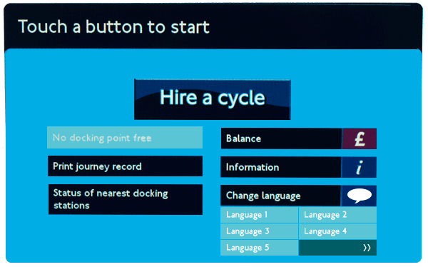
The new design above shows a more generic speech bubble icon instead of a flag to represent language. It also displays five languages on the home screen and a button alluding to further languages being available.
Would the above screen work better at showing language options? Potentially — of course the only true way to know would be to test this with real users.
When it comes to developing for internationalisation, there are two very important ISO codes: ISO 639 (languages) and ISO 3166 (countries). Within these codes there are two- and three-letter code variations for both language and countries. The simplest (and one of the most popular) are the two-letter code variations: ISO 639-1 for languages and ISO 3166-1 for countries.
Unsurprisingly, many countries and languages share the same two letter code. Spain and Spanish (es), France and French (fr), Thailand and Thai (th).
But there are some rather important languages codes that do not correlate directly with a country code. For instance, the Arabic language for uses ar which is Argentina’s ISO 3166-1 code. English’s en has no matching country code at all — it’s official 3166-1 code is gb for Great Britain. The Chinese language is zh in ISO-639 whereas China’s ISO-3166-1 code is cn.
Music streaming service Deezer uses flags to represent languages. One example in particular shows the pitfalls in assuming direct connections between languages and flags: the language code for Malaysian (ms) is different from the largest Malay-speaking nation, Malaysia (my in ISO-3166-1 — also, Malaysian is also spoken in Singapore).
Instead the flag next to the Malay link (Melayu) is actually that of the tiny Caribbean island of Monserrat, whose country code is (of course) ms.
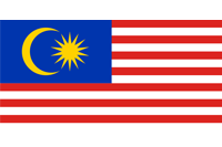
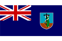
For the record — Montserrat is nearly 35,000km away from Malaysia
The largest and simplest lesson from the Deezer example is to simply check that any flags you use (for any purpose) are actually the right ones.
But this issue wouldn’t have arisen at all had Deezer not decided to compliment languages with flags from the outset.
Update, January 6th 2013: Deezer have fixed their Malaysian flag, but are still using flags for their language options
Bab.la is an excellent online language resource with online translation as one of its core services — in an impressive 22 languages.
The site makes heavy use of flags as iconography, with some interesting flag choices: Arabic is represented by the Egyptian flag, Swahili by the Kenyan flag and Hindi by the Indian flag.
Arabic is an official language in 24 countries other than Egypt (however, Egypt is by far the largest by population) and Swahili is an official language in four countries. While Hindi is the most widely spoken language in India, there are 22 official languages in India.
Furthermore, English is represented by the Union Jack; however it is an official language in over 50 countries. Also, the United States which has many more English-speakers than the United Kingdom. (The same argument can be applied to the use of Spanish and Portuguese flags for those languages in relation to Mexico and Brazil respectively).
Regardless of whether flags are appropriate in this situation, another question can be posed: do the flags actually aid in legibility of the translation menu? Or are they actually distracting?
Consider the Google Translate interface that supports 65 languages:
Arguably the Google Translate is easier to read and far more compact on screen: and it achieves this in part by not using flags to represent languages.
It’s hard not to look at the Bethesda Blog ‘gateway’ page and ask whether they’re asking for your location or language.
Many sites that use flags to represent languages rely on the subtle implication that a flag will assist users in choosing their language. But the fact that this page is solely dedicated to language selection and only presents users with flags explicitly suggests the site is only accessible by users from the USA, France, Italy, Germany and Spain.
The flags are also large and bold in their size: there’s no excuse here that as icons they take less space.
Would simply listing the language names not be far simpler and more effective?
After all, on Bethesda’s main site, they’re doing exactly that:
While flags are sometimes used to show the availability of translated content, there are many other methods and conventions available — many of which are simpler, more effective and more appropriate.
If the content is specific to language and country, then individual flags are highly appropriate. But languages within countries should not be generalised: many countries such as Belgium, Canada, India and Switzerland have a mix of different primary languages. The reverse goes for languages — languages are not always exclusive to countries. For instance English and Spanish are both spoken by far larger numbers of people outside of England/Britain and Spain respectively.
Sometimes flags are used as a more general abstract concept in communicating the presence of translated content.
Some potential problems with this approach is that it lends itself more to ‘global’ or ‘international’ symbolism. While this certainly overlaps with language, it may not be the best choice unless your content varies both in language and by region. For instance, many airlines may want to present different languages and different content depending on a user’s location.
But take a website such as city tourist board or local government. This approach is not particularly suitable, as the content is unlikely to change based on a users location: only on a user’s language.
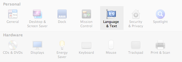
The Apple OS and many Linux distributions use a United Nations-esque flag to represent ‘international’ options. These settings also commonly overlap more than just languages: they often include date formats, number and currency formats and also language. Within a system preference environment, this icon works relatively well – as there is very little for it to be confused with. But in a broader context of the web and beyond it may be more confusing: users may wonder what the United Nations has to do with your content.
The globe is a powerful and highly recognisable icon. While that may be its main strength, it also represents a weakness, as it has come to represent a broad range of subjects.

The globe can broadly be interpreted as region, country, timezone as well as a representation of networks and the web. For better or for worse it has also been chosen by Facebook as the icon for ‘notifications’. John Yunker argues why this is a bad choice – and while his arguments are convincing – it still means that another meaning has become attached to the ubiquitous globe.
Returning to some of the reasons why multiple flags may not work, the same reasons can be applied to the globe: if your content is regional/country and language specific then it can be a good choice. However if you’re only providing the same content to all users in a variety of languages, the regional-aspect of the globe icon might not be the most appropriate choice.
OMC² Design Studios in Italy have thought about many of the dilemmas already described here and have attempted to create an icon that best represents translations.
![]()
There is obviously a need for an icon of this sort, but the problem with the icon they have produced is that it is perhaps too abstract. Nothing in the icon really suggests translation or languages. While globes and flags may not be the best they would still provide a far more powerful visual message than this icon.
Update (May 2014) – this project has changed it’s recommended icon to this icon:
Designed by Farhat Datta this ‘turnstyle icon’ won the A’ Design award in 2013. It is arguably a far stronger icon that reflects other approaches outlined on this page.
Speech is inherent to language – but in the majority of situations translated content is read and not heard (or spoken) – especially online.

Much like the globe, the speech bubble is often also used to symbolise ‘contact’ and also messaging — such as with Google Talk and Apple’s iChat shown above.
Another approach to graphically representing translation is mixing characters: probably the most ubiquitous being Google Translate’s logo, which places the Chinese character ‘文’ (which can mean script, page or character depending on context) next to the latin ‘A’. This approach definitely relates to the reading element of translated content far stronger than speech bubbles do. It also works well through contrast: Chinese and latin characters are so different it’s hard for this design to have many other meanings apart from one related to language.
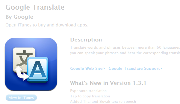
Google Translate is also a truly multiplatform product: the same Chinese/latin icon appears across not only the web but also mobile and tablet apps.
Microsoft’s approach to translation icon design reflects Google’s: the only difference being a choice of the Japanese letter ‘あ’, which is the first character in Japanese alphabetical ordering.
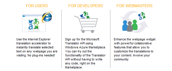
Much like Google, this icon is seen across many platforms: from Outlook through to Bing Translate.
Design-wise, the mixed character approach is very strong: it is simple and uses contrasting icons within itself to evoke a higher meaning. Coupled with the clout that Google and Microsoft products have, is this the strongest convention we have for symbolising translation?
While these icons pertain specifically to providing a translation service, pre-translated content can certainly leverage the fundamental concept of these icons.
Is the mixed script the best icon available – or are there other approaches that are more powerful and appropriate?
Dropdown menus, when used well, are a very useful form of interaction. While the pros and cons of dropdowns have been well discussed elsewhere, it’s useful examining them in the context of language/region selection.
When a user interacts with a dropdown menu, it’s a reasonable expectation that there are a certain degree of choices contained within the menu — hence the designer’s choice in hiding the content.

Left to right: The Guardian, Moo and CNN
But looking at the region selection dropdowns at The Guardian and Moo, the dropdown only reveals one extra choice: wouldn’t this be far simpler (and more obvious) as either a radio button or list of links? CNN has more regional choices than The Guardian or Moo, yet they have opted just to list the options available.
Apple’s website also features a two-items dropdown for
languages for both their Swiss and Belgian sites
CNN’s approach is simple and effective: don’t complicate selections of anything on your site with a dropdown unless there are numerous options that would otherwise clutter the page.
(Note: while CNN is very well designed, linking to the Arabic edition of its content would be better done with Arabic written in its localised form rather than just the English).
The LEGO website is available in 17 languages. When a user goes to select language, they are prompted to first choose their country or region and then their language as appropriate.
Belgian users have the option of French or Dutch content specific to their country; Spanish users can select Spain or Latin America as appropriate.
The use of flags here gives priority to country/region first — which is why it works. Only for Latin America is a flag not used, as it is obviously referring to a whole region and not a specific country. Language is a secondary option. In this scenario, LEGO’s use of flags works very well.
As a global brand, LEGO has registered domains in many other countries even though they do not have local content for all of them. The site does its best to redirect users to the most appropriate version of the site. Australia users visiting www.lego.com.au are redirected to the UK English site; Canadian users visiting www.lego.ca are redirected to the US English site.
As the site gives priority to country over language, this is a much better approach than just combining flags with language names.
However, there are limitations to this approach: Swiss users accessing www.lego.ch are redirected to the German site. French-speaking Swiss users may not appreciate this, but given there is no specific Swiss content available this is far more acceptable than just redirecting them to a generic German-language site. Ideally, however, the LEGO site would do better checking the language of the user and redirecting them based on that — not just the domain they’re visiting.
While it’s not perfect, the thought that LEGO has put into its user experience for international users is highly commendable.